Goplan 2.0 logo creation process

Goplan had a facelift a few weeks ago with the launch of v2 and we thought it might be interesting to tell you guys about the creative process behind the new logo.
The first thing we had to do was come up with the new logo idea, so I sent an email to everyone at WBS asking them to write down at least five objects/images they associate with Goplan. The results were pretty interesting.
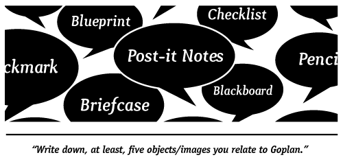
We had a good number of answers but some stood out. The most chosen were checklist, post-it notes, blueprint, blackboard and briefcase. This ended up working great - we got a bunch of great ideas of where to go with the new identity.
When that was done I needed to get all the ideas on paper to start thinking what might work best. After sketching a few of the ideas, a really good one came to my mind. The concept was: two different images, one for each part of the name: Go+Plan. This way people could read the logo and see the name without the text. It was simple, efficient and I really believed it might work.
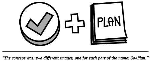
The next step was picking the best concepts for each of the words. For “Go†it was easy, a cool checkmark would do just fine. For “Plan†i looked at the pool of ideas from the survey and decided that the blueprint would probably work best.
I grabbed my stuff and rushed to the office to share the concept with everyone. They liked as much as I did which was great! The hard part was over and now I had something concrete to work on.
I started drawing a few blueprints but got to a point where a bit of inspiration would do wonders, so I searched for “blueprint†on Compfight [1] and got a few nice results. When I thought I had a good starting point i opened up Illustrator and began to work on the final logo.
The first thing i started working on was the blueprint. I did a simple 2d blueprint with some diagrams, then i used the 3d>rotate tool to give it some depth.
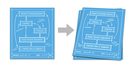
After some tweaks on that i started working on the check-mark and I thought the best was giving it a smooth 3d effect. Just like the blueprint, i made a 2d version first, but now i used the 3d>extrude&bevel tool to create the 3d look.

I combined the two elements and voilá:
![]()
Then it was time to pick a good font to match the blueprint and check-mark icon. I ended choosing ITC Officina Sans from ITC. I felt the 3D look from the check-mark was fine so i did the same thing to the font.
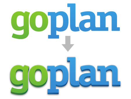
Combining all the elements this was the final result:

So now after finishing the logo, i moved on to create the icons and some extras. To create the icons i saved the blueprint+checkmark in a few different sizes and opened them in Photoshop to tweak the smaller ones.
![]()
Notice that the smaller icons are different because in smaller sizes the logo was too complex so i change it to a simpler version and I think it worked nice.
Then i made some different versions of the logo as you can see below.

And that was that, hope you find this post useful and don’t forget to give us your feedback, we really value it.
[1]: Compfight is a great tool to look for stuff on Flickr. I highly recommend it if you’re a creative and need a little extra inspiration (and who doesn’t?).
Awesome post.
Nothing more inspiring than hearing other people’s creative process (yes, even more than Compfight :p). I do like the logo even though I’m kind of “unsure” about the 3D font: it seems to get weird rendering most of the time… :/ Looks nice on that image where you show the arrow from flat to 3D; looks “pixely” everywhere else (blame antialias). :(
Again, great post. Thank you for sharing.
Kudos WBS.
~Levi F.
Comment by Levi Figueira — June 29, 2009 @ 3:24 pm