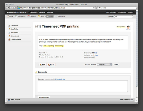
New ticket viewing UI
As you may have noticed in the past couple of weeks, we’ve been doing some UI retouches across the application. This means better forms, better text displays and headline hierarchy among other small fixes. A few places were in dire need of a little more love, and one of those places was the ticket viewing UI - so we redid it.

The new UI (above) can be seen it in greater detail either on Flickr or on your own Goplan accounts - as we just updated the app with it. This particular design update won’t be news to those of you who follow us on Twitter because we hinted at it during the weekend. For those who didn’t know about it, we hope you like the surprise.
As always, feel free to let us know how we’re doing either through the comments to this post, email, twitter or Get Satisfaction. Thanks!
I think the UI tweaks were the exactly what I needed to make the switch from Basecamp to GoPlan (that, and time-tracking starts at $49/mo. for Basecamp).
I plan on making the move shortly-keep up the good work!
Comment by Jason Pelker — December 1, 2009 @ 4:19 pm