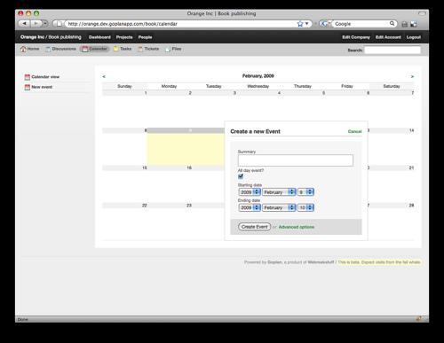
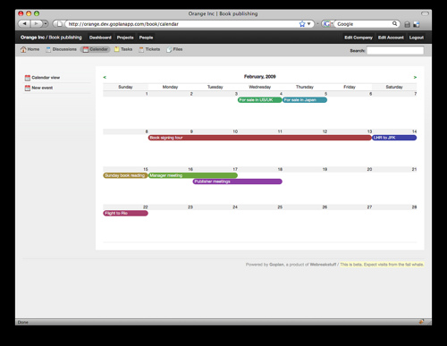
It’s that time of the week again. We’re continuing our series of previews of the upcoming Goplan 2 functionality (you can see earlier previews for Tasks, Tickets, the new navigation) - this time, we’ll talk briefly about the new implementation of the Calendar. As with everything else, we scrapped the code from the current Goplan and redid it completely. This means we can do cool stuff like in-place event creation - and redo the interface with it.

Creating multi-day events is a breeze. You select your days by dragging and the create event modal pops up to confirm and ask you for an event title and extra details (this behavior is visible on the screenshot above). No use in hiding it, we love the way iCal works on the mac - so we got the best of it and put it into our new calendar. I think you’ll love it.

Sync: Having a great calendar is great, but it makes sense to let you bring it with you - we can’t assume you’ll be at your computer all day - so we’re working on tools to sync our calendar with the tools you bring with you. The previous Goplan calendar already synced with iCal and Google Calendar, so we’re improving that integration so you can bring your Calendar with you in your pocket (say, with an iPhone).
There’s aditional calendar screenshots up on Flickr, and if you look closely, you’ll find a couple of screenshots of our new file interface, which we haven’t talked about yet - but will next week. Have a great weekend!
I’d like to start off this post by thanking everyone who’s been sending feedback and ideas for Goplan 2 - you guys are awesome, and we loved your input on the last post about our navigation ideas. This post isn’t about the past, though, but the future. And Goplan 2′s Tasks in particular.
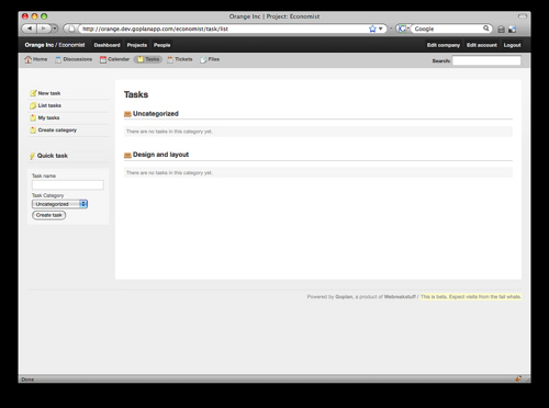
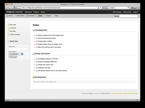
As with the rest of the app, we’ve completely reworked our Tasks implementation, and while the screen below might look like much has changed (apart from what we consider to be a much cleaner - and better - layout and design), things sure have improved. Here’s how:

The first thing we completely redid was the need to click through to tasks in order to create new subtasks. Just like you can quickly create tasks without leaving the task list screen, you’ll also be able to create new subtasks from the same screen, without any page refreshes. While that’s not necessarily visible in screenshots, we’ll be posting a series of videos highlighting the new functionality soon.

Also, tasks now benefit from our new filtering mechanism (a video on it is coming tomorrow), which makes it much easier to find the tasks that relate to you - either by being assigned to you directly, or just being in your particular area of expertise. That way, if you’re a design expert, you might click the “design” tag to filter everything out and focus on your work.
Coming (very) soon: a preview of our new calendar (you’ll like it, I’m sure!) and highlight videos of how the new features work. Keep your feedback coming, we love it. And get ready, we’re almost there!
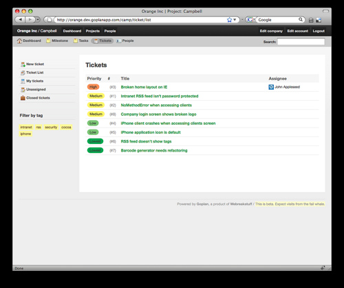
In a brainstorming session today, a member of our team posed the question of whether it would be more effective to have contextual navigation on the left-hand side of the site instead of on the right. With the UI code rewrite we did for Goplan 2, the change between left and right becomes really easy, so we decided to ask refer to the opinion of our users to make a more informed decision.

The image above shows the left-side navigation we’re testing, and the previous preview posts we did show the older right-side navigation. Which do you prefer? Alternatively, we could just have the option to alternate between right and left on the user preferences screen, but we lean towards simplicity, so the extra option would be less desirable.
Interestingly, I felt weird about the change to the left-hand side at first, but now I’m actually leaning towards it. It almost feels like it removes clutter and mouse moves. Everything becomes snappier. What do you think? Leave a comment, we appreciate your input. Thanks!
