Ask the users: Right or Left?

Fred Oliveira on February 3, 2009, Comments (22)

In a brainstorming session today, a member of our team posed the question of whether it would be more effective to have contextual navigation on the left-hand side of the site instead of on the right. With the UI code rewrite we did for Goplan 2, the change between left and right becomes really easy, so we decided to ask refer to the opinion of our users to make a more informed decision.

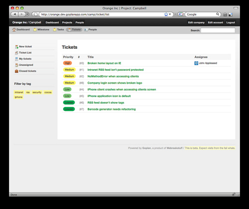
Goplan 2 Preview: Left-hand Navigation

The image above shows the left-side navigation we’re testing, and the previous preview posts we did show the older right-side navigation. Which do you prefer? Alternatively, we could just have the option to alternate between right and left on the user preferences screen, but we lean towards simplicity, so the extra option would be less desirable.

Interestingly, I felt weird about the change to the left-hand side at first, but now I’m actually leaning towards it. It almost feels like it removes clutter and mouse moves. Everything becomes snappier. What do you think? Leave a comment, we appreciate your input. Thanks!
Comments:

Right! being right handed, the mouse gestures are always focused on right side of the screen. And I’m a Go Plan User too.

I find that left hand menus are more consistent with my overall Web experience (gMail, wordpress, drupal). The argument from a usability standpoint is that the world generally reads from left to right.

Having said that, its a very low learning curve for a new user - and none at all if they are coming from Base Camp.

Either way, my vote is for simplicity. You choose. We’ll use.

ps - thanks for the great product. I’m sure version 2 will rock faces.

I see the points of both left and right. In the end it matters little. I say go for left, it’s like Kedron said. It’s more consistent with other applications. But really I don’t care as long as we get our hands on this bad boy soon!

any idea when this will come out? I thought I heard a while back it was coming in January. Obviouslly that is not the case so I was wondering when? I don’t need an exact date but a season would be nice. ie: spring, fall, etc. LOL.

Adam: we were aiming for Q1 2009, so anytime until the 1st of May won’t feel like failure ;-) We’re aiming for sooner than that, though. We’re not that far out now. Just a little while longer!

The primary action on this page is to view tickets and to get to the data associated with them. Putting the sidebar on the left lets the main content come first in the visual flow. If the user wants to add a ticket or see tickets assigned to them, they’ll go looking for the option to do so.

Thanks for letting us have a voice.

What about it being user customizable? Default left.

Right. Looks to much like my email. I hate email.

I meant sidebar on the right, doh!

i would prefer the left side.
just my 2cents ;)

great to see gp2 evolving :D
keep up the good work!

The right side!!
I think it makes navigation easier, while focusing on content.
No need to move the eyes in the menu, you only interact on the lists (for example)
Similar to other apps, some things should not change!

Left side - it’s closer to everything.
And also think carefully about keyboard navigation and tab order for power users.

Great job so far!

I’m in favor of the left hand side as well. Look forward to trying out the new version.

KVW

[...] been sending feedback and ideas for Goplan 2 - you guys are awesome, and we loved your input on the last post about our navigation ideas. This post isn’t about the past, though, but the future. And [...]

Left

Left. I know the “cool” thing lately is the right side, but I find that the left reduces mouse movement and keeps the options closer at hand (especially when the browser window is wide - then the right side is too far away).

right side… but wouldn’t mind seeing the user being able to decide.

Heya! We’re using your software right now and i’m interested in becoming a beta user… let me know your process… we’d love to help out!

Left is best:
http://www.usability.gov/pubs/040106news.html

My vote is right side, generally I want to quickly scan from left to right but have action menus on the right seems like a more logical flow.

I say right. I don’t think it really matters all that much, but I prefer right. The eye moves from left to right in the western world (as others have noted), but to me, that doesn’t mean it should go on the left. On the contrary, I would say that would mean whatever you want people to see or interact with first would go on the left. To me, the primary content area is where most of the interaction really happens and the sidebar is where navigation/tool selection happens. Therefore, in my mind, it would make more sense for the sidebar to be less important than the primary content area, and therefore go on the right. But again, it doesn’t really matter to me. I would like to see GoPlan 2 available soon though :)

You could have used Powernoodle for that brainstorm session!

Sorry, the comment form is closed at this time.