Updates! And a (big) suprise.

Fred Oliveira on June 29, 2009, Comments (10)

We’ve been working extensively on improving our existing functionality, and as promised last week, we’re pushing quite a few changes to Goplan today. Here’s what’s been changed (and make sure you check the very end of this post for what may be a pretty good surprise - itself coming very soon too):

Functionality updates

Milestones: The milestone functionality took quite a revamp. Milestones now have their own page where you can quickly have a glimpse of what needs to be accomplished in order for a project milestone to be hit. You can access milestones from the project dashboard (click the project name anywhere on the site or the Home button when inside a project, and Milestones will be right on the sidebar).

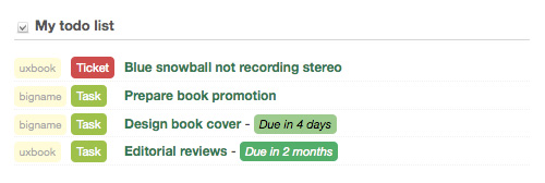
Task updates: Tasks are now colored when they have a due date. Green is for tasks who are still days away, yellow is for tasks under 3 days away, and red is for tasks where, well, you know. They’re in the “get me done right now” category. We’ve all been there, though, don’t worry. These changes are also reflected on your dashboard - if you have tasks assigned to you, they’ll be color-coded as well in order for you to know what’s really important.
tasks1

Discussions: We completely revamped the discussion list and each discussion’s individual page. Although Goplan has a fluid layout (meaning that it is as wide as your browser), discussions typically involve large chunks of text, which means readability goes down if the text is too wide. So we fixed that by giving discussions (the text block) a fixed width, which should help you read through those paragraphs properly.

Company logo: We’re allowing companies to remove their existing logo (have you added yours, by the way? Login pages look 1000 times cooler with a company logo) if they added one by mistake. We missed this one when we launched Goplan 2 and it was about time we fixed that issue.

Comments by email: We heard you. We’ve been getting huge amounts of feedback about being able to reply to updates by email (which is great if you’re on the road), so whenever you get an email about an update, you’ll be able to reply back and your reply will be added to the comments list for the associated item (which can be a ticket, task, etc.)

Two other minor things: Added comment counts next to files and events on the calendar list view. We also changed the way we display names (we now show your user alias as well as your name) so we can do some really smart stuff with tags in the future. Keep an eye out.

“One more thing.”

Ah, we all love that moment in a keynote. You’ve been asking for weeks, and we’ve been secretly working on it. You know what we’re talking about: time tracking. We’re not spilling all the beans already, but here’s a quick hint of how awesome it’s going to be (because a picture is worth a thousand words):

timetrackinghint

Yes, thats a Lego Darth Vader - in a motorbike. So awesome (don’t miss the important piece of the picture, though). So yes - time tracking! It’s coming really soon. We’re just adding final touches and will have a lengthy post about time tracking on Goplan in the next few days. Keep an eye out! We’re so excited about this.

Goplan 2.0 logo creation process

gmorais on June 29, 2009, Comments (24)

logo1

Goplan had a facelift a few weeks ago with the launch of v2 and we thought it might be interesting to tell you guys about the creative process behind the new logo.

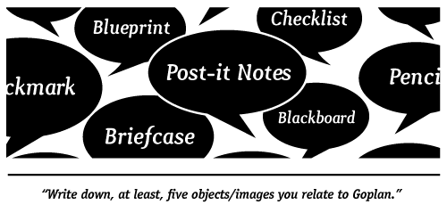
The first thing we had to do was come up with the new logo idea, so I sent an email to everyone at WBS asking them to write down at least five objects/images they associate with Goplan. The results were pretty interesting.

tip_13

We had a good number of answers but some stood out. The most chosen were checklist, post-it notes, blueprint, blackboard and briefcase. This ended up working great - we got a bunch of great ideas of where to go with the new identity.

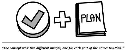
When that was done I needed to get all the ideas on paper to start thinking what might work best. After sketching a few of the ideas, a really good one came to my mind. The concept was: two different images, one for each part of the name: Go+Plan. This way people could read the logo and see the name without the text. It was simple, efficient and I really believed it might work.

tip5

The next step was picking the best concepts for each of the words. For “Go” it was easy, a cool checkmark would do just fine. For “Plan” i looked at the pool of ideas from the survey and decided that the blueprint would probably work best.

I grabbed my stuff and rushed to the office to share the concept with everyone. They liked as much as I did which was great! The hard part was over and now I had something concrete to work on.

I started drawing a few blueprints but got to a point where a bit of inspiration would do wonders, so I searched for “blueprint” on Compfight [1] and got a few nice results. When I thought I had a good starting point i opened up Illustrator and began to work on the final logo.

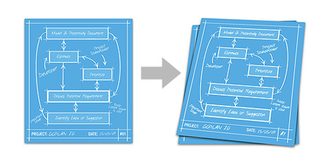
The first thing i started working on was the blueprint. I did a simple 2d blueprint with some diagrams, then i used the 3d>rotate tool to give it some depth.

blueprint

After some tweaks on that i started working on the check-mark and I thought the best was giving it a smooth 3d effect. Just like the blueprint, i made a 2d version first, but now i used the 3d>extrude&bevel tool to create the 3d look.

checkmark

I combined the two elements and voilá:

icon256

Then it was time to pick a good font to match the blueprint and check-mark icon. I ended choosing ITC Officina Sans from ITC. I felt the 3D look from the check-mark was fine so i did the same thing to the font.

logo_4

Combining all the elements this was the final result:

logo1

So now after finishing the logo, i moved on to create the icons and some extras. To create the icons i saved the blueprint+checkmark in a few different sizes and opened them in Photoshop to tweak the smaller ones.

icons

Notice that the smaller icons are different because in smaller sizes the logo was too complex so i change it to a simpler version and I think it worked nice.

Then i made some different versions of the logo as you can see below.

logos

And that was that, hope you find this post useful and don’t forget to give us your feedback, we really value it.

[1]: Compfight is a great tool to look for stuff on Flickr. I highly recommend it if you’re a creative and need a little extra inspiration (and who doesn’t?).

Goplan 2 update schedule

Fred Oliveira on June 18, 2009, Comments (4)

As some of you might have noticed, we’ve been introducing small updates and changes to Goplan 2 since we launched, mostly based on your (both awesome and very welcome) feedback. Now that things are running smoothly, we’re considering an update schedule moving forward. From now on, we’ll be doing bi-monthly updates to Goplan with new features (or feature updates) as well as the ongoing bug-fixes (should there be any).

Coming June 29: The first of these functionality updates is coming on Monday, the 29th of June, where among other things (for which we don’t want to ruin the surprise already) we’ll be updating our milestone functionality quite a bit, making it easier for project managers to assign tasks to given milestones and manage them effectively. The second of these updates will be coming 2 weeks later, and so on.

We’ll be using this blog more often to tell you about both small and large updates to Goplan 2, as well as share some of the tips and tricks that users much like you have been sending in. Do send us email if you have any feedback, we are extremely happy about everything we’ve been hearing. We hope you’re happy about the product as much as we are. Coming next week: hints on future functionality.